Giving Consumers A Taste of Island Life
Giving Consumers A Taste of Island Life
One year ago I had the chance to travel to Hawaii, It seems like an eternity ago and can’t wait to travel again. Each morning, you awake to the sound of waves breaking on the shore. The skies are blue and cloudless, the water offers an emerald quality as rays of sun split across its surface, it’s heat spreading across your skin. Palm trees sway gently in the breeze, and volcanic mountains loom in the distance. The island is teeming with life — an expanse of terrain that is as beautiful as it is rugged, rife with exotic plants, animals, and locals who have long called these incredible surroundings home. Rich in nature’s simple pleasures, Hawaii is popularly described as one of the most beautiful places on earth. A true paradise on earth.
‘Island life’ is both appreciated and envied by many; those of us who have only experienced Hawaii culture in passing, and even those who simply have the island scrawled at the top of their bucket list. And, for years, brands have worked tirelessly to capture the essence of island life to share with customers. The tastes, the smells, the imagery, the ideologies, the language, the mindset — all of these elements combined set Hawaiin products apart from their international competitors. Unsurprisingly, package design plays an integral role in this differentiation.
Over the years, our studio has had the pleasure of working with a variety of global brands. Recently, while in Hawaii I was able to witness first hand examples of their branding and design for local and regional brands. This exposure is essential in helping us develop design solutions for our clients. It also helps us see how design elements are used in a unique way to appeal to the consumers of the specific market.
In helping bring brands to life, often graphic elements are introduced to help communicate a brand’s character and personality. Whether intended for a local or a traveler passing through, the Hawaiin products which stood out during my trip used design to provide a taste of island life (in some cases, both literally and figuratively).
Kona Beer
During my trip, Kona Beer quickly captured my attention not only for it’s design but how smooth it went down in the heat. Beloved among craft beer connoisseurs both locally and abroad, Kona Brewery offers a delicious variety of ales, lager, and IPAs. Known for their signature, tropical hop and refreshing flavor, the designs on their packaging includes tropical imagery and bright, stand-out colours.
The brewers label design features local images such as canoe racing, a popular activity amongst locals; specifically, one which is enjoyed across age groups, whether fans are simply watching or participating. They complimented this design with depictions of island flowers, waves, and surfing culture. This design choice helps to convey feelings of escape, which is especially impactful in the domestic markets where Kona beer is sold. Canadians might not be able to take a vacation right now, but we can take a sip of a smooth, light-bodied Kona Big Wave golden ale.
Island Jellies
Maui Fruit Jewels product range offers consumers a delicious, high-end product worthy of snacking on your own, or gifting to a friend. In an effort to convey the exotic nature of the jellies, the brand included illustrations of exotic fruits, set against unique colour contrasts, geometrical patterns, a global design trend. The way the package is designed, using high-end materials and island-esque imagery, along with a warm colour pallet, the jellies are a treat you can easily give as a gift without having to wrap them.
Island Shortbread
For Maui Fruit Jewels’ take on high-end shortbreads, it looks like they wanted to achieve a sense of ‘calm’ in the illustration. They treated the line extension in a unique manner, to help distinguish these cookies from others offered by the brand, which rely on similar aesthetics. The illustrations are artsy and delicate, portraying a premium feel along with elegant typography and an rich color pallete to capture the attention of shoppers from the shelf. Similar to the island jellies, the design of this product makes it suitable for a gift.
Maui Sweet Cakes
Hand-crafted in Maui, Maui Sweet Cakes encourage consumers to ‘spread the aloha’. For these shortbread cookies, the brand achieved strong branding and positioning through the use of elegant typography positioned consistently on packaging. The use of a ‘window’ shows the product, so consumers can see what they are about to purchase. They also leveraged strong colour coding, to ensure shoppers can easily differentiate between flavours. Products like this help to evoke an exotic feeling, serving as a temporary escape from reality. Sometimes, they might even bring up long-forgotten memories as consumers consider them in the aisle of a local store.
Island Water
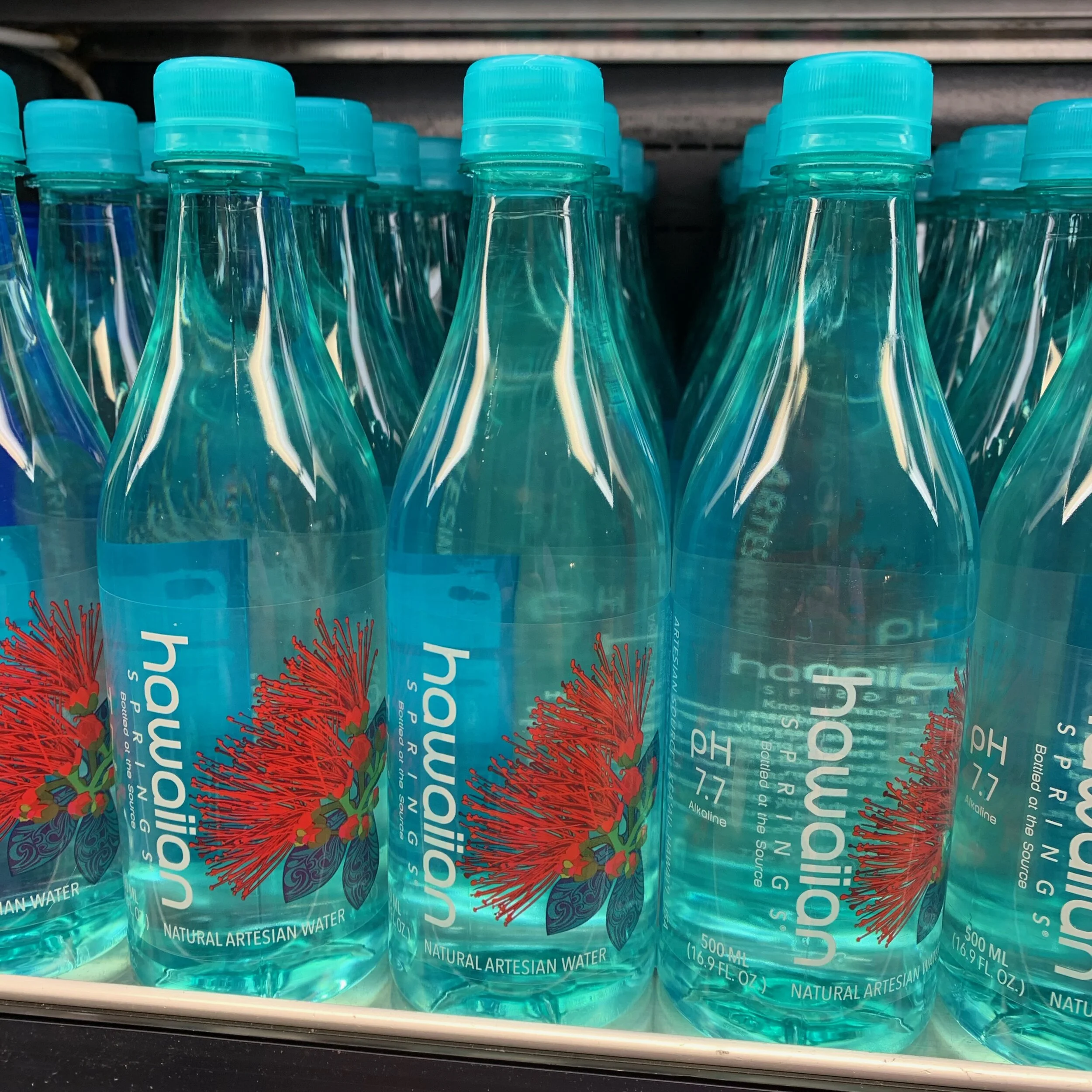
Hawaiin Spring water isn’t simply a product, it also promises a unique story. Offering consumers a “taste of paradise”, the natural artesian water comes from deep earth aquifers within ancient lava rock on the Big Island of Hawaii. With this in mind, it struck me that the bottle was designed to remind consumers of the ocean, and give the product a natural feel that is true to its brand. The design is rather simplistic, which is different from other local designs, but it has proven to be extremely effective.
Fiji water, a popular, premium-priced water available here in Canada, achieves a similar aesthetic with their simple, yet exotic bottle design. Interestingly, almost all premium water brands opt for a unique bottle shape that helps to differentiate their products from competitor brands.
Aloha and hoping to return to Hawaii once again.


